
The fastest way to spot an amateur edit isn’t the shoot. It’s the export. Most Lightroom editing mistakes hide in plain sight until a client opens the gallery on their phone and the skin tones look like a fake tan gone wrong. This walkthrough covers the fixes that actually matter in paid work.
It’s the Sunday after a Saturday wedding. The catalog is open, the coffee’s cold, and there are 1,400 raw files staring back at you. Somewhere in that grid is the moment the couple will print four feet wide and hang over their bed. And somewhere in your workflow is a slider habit that’s quietly wrecking every frame before you even notice.
Adobe Lightroom Classic is the tool most working photographers live inside, and it rewards good habits while brutally punishing lazy ones. The difference between a gallery that gets referrals and one that gets crickets often comes down to four or five repeatable decisions. Below is a review of where the software leads people astray, and how to correct the most common Lightroom editing mistakes before they reach a deliverable.

Lightroom Editing Mistakes At A Glance
| Problem Area | The Common Mistake | The Fix |
|---|---|---|
| Exposure | Chasing the histogram, not the subject | Expose for the face, ignore the graph |
| Color | Auto white balance across a full set | Set WB once, sync per lighting scene |
| Sharpening | Global sharpening at export | Masked sharpening, output-specific |
| Export | Wrong color space for the medium | sRGB for web, tag your profile |
Why Do Exports Look Different From The Edit?
This is the ghost that haunts every new editor. You nail the edit on your calibrated monitor, feel great about it, send the gallery. Then the client texts: “Why are we so orange?”
Nine times out of ten, it’s a color space problem. Lightroom works in a huge internal space, but the web assumes sRGB. Export in Adobe RGB or ProPhoto without embedding a profile and untagged browsers just guess. They guess wrong. This is one of the most invisible Lightroom editing mistakes because it never shows up on your screen, only on someone else’s.
I sent a full engagement set once that looked flat and desaturated on the client’s laptop while glowing on mine. Took me two days to realize I’d exported in a space her machine couldn’t read. Set your export to sRGB for anything headed to a screen. Save the wide-gamut files for the print lab that actually asks for them.
The Exposure Trap: Editing The Histogram Instead Of The Photo
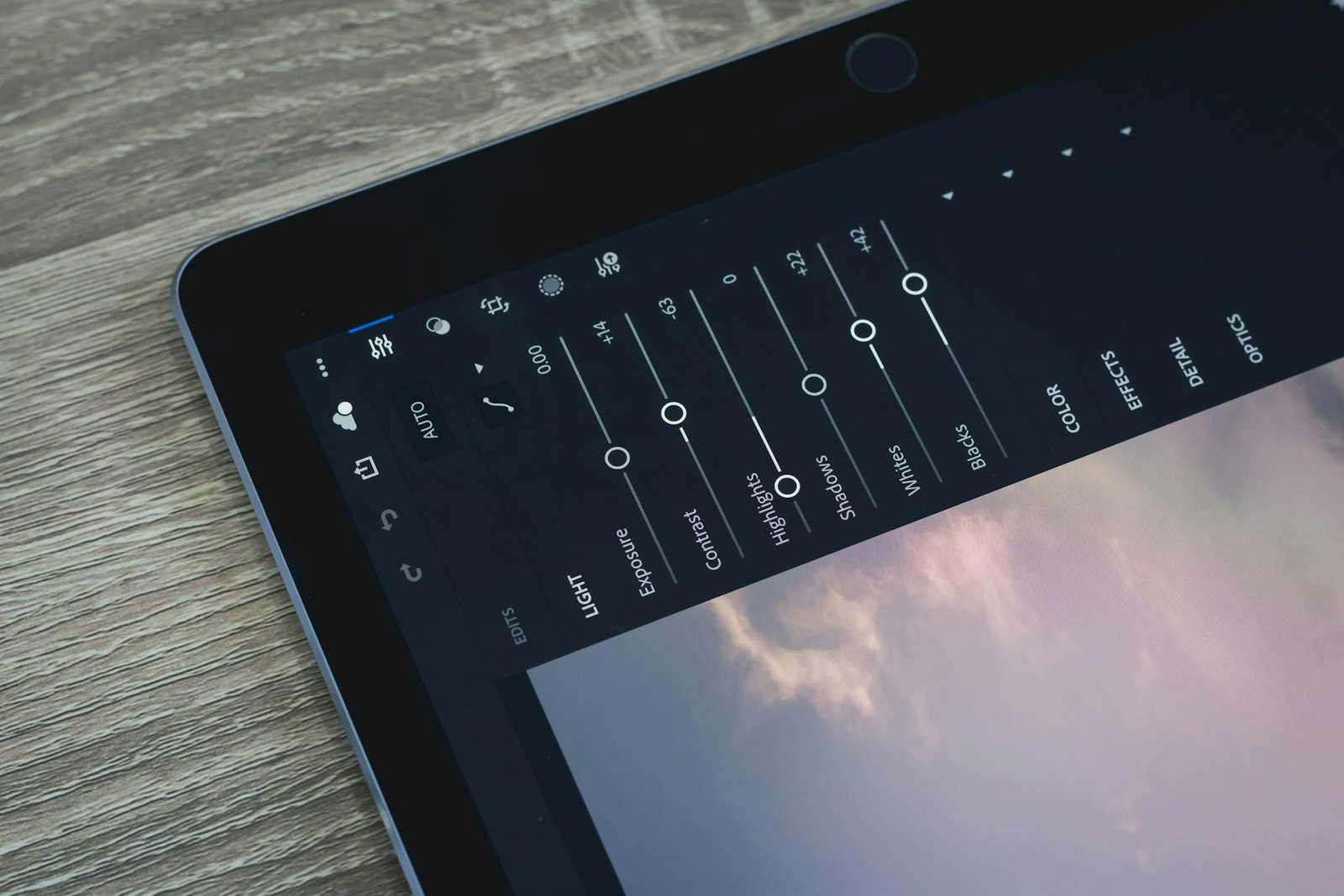
New editors treat the histogram like a scoreboard. Push everything until the graph fills the middle, avoid the edges, feel accomplished. But the histogram doesn’t know your subject is a bride in a white dress, and it doesn’t care that her face is the only thing that matters.
Expose for what the eye lands on. On a portrait, that’s the skin. Let the whites clip a little if the dress demands it, let the shadows go dark if the mood calls for it. A technically “correct” histogram that leaves a face muddy is still a failure. Fighting the graph instead of reading the frame is where a lot of Lightroom editing mistakes start, and it’s a habit that follows people for years.
The related sin here is the highlights-to-minus-100 reflex. Yanking that slider all the way down doesn’t recover blown data, it just makes bright areas look gray and lifeless. If it’s clipped, it’s gone. Recover gently or reshoot the lesson into next time.
Color: The Fastest Way To Look Amateur
Color is where taste and technique collide, and it’s unforgiving. The single biggest offender is relying on Auto white balance across an entire event. Auto shifts frame to frame, so a reception under mixed tungsten and LED becomes a slideshow of green, orange, and magenta casts that no client can articulate but every client can feel.
Set white balance deliberately for each lighting scenario, then sync it across that batch. Ceremony light, cocktail hour, dance floor: three settings, three syncs. Done. If you want to go deeper on why certain palettes read as “off” even when the exposure is fine, our breakdown on color theory for photographers is worth an afternoon.
The other color trap is oversaturating to compensate for weak light. Cranking Vibrance to mask a dull scene turns green foliage radioactive and skin into brick. If your color feels flat, the answer usually lives in the shoot, not the slider. Learning to work natural light well fixes more color problems than any editing panel ever will. These are the color-side Lightroom editing mistakes that separate a $500 shooter from a $5,000 one.
Sharpening And Noise: Where Zoom-To-100% Ruins Everything
Sharpening is the last thing anyone thinks about and the first thing that betrays a rushed edit. The classic error is global sharpening applied at high values, which crisps up the eyes but also carves halos into skin, sharpens sensor noise in the shadows, and makes bokeh look gritty.
Use the masking slider. Hold Alt or Option while dragging it and the preview shows exactly where sharpening lands: white areas get it, black areas are protected. Keep it on edges and detail, off skin and sky. Then match your sharpening to the output. A frame destined for an 8×10 print needs different treatment than a thumbnail on Instagram, and treating them identically is one of the sneakier Lightroom editing mistakes.
Noise reduction has the opposite failure mode: too much of it. Smashing luminance noise to 80 turns a moody, grainy dance-floor shot into a plastic wax figure. A little grain reads as texture. A lot of smoothing reads as a phone filter. I over-smoothed an entire reception set early on because I was scared of noise, and the couple’s faces looked airbrushed in a way nobody asked for. Grain is not the enemy. Mush is.
Presets, Clipping, And The Batch-Edit Blind Spot
Presets are fine. Presets as a finish line are not. Slapping one preset across 300 varied frames and calling it done ignores that every frame had its own light, and it bakes the same Lightroom editing mistakes into all of them at once. Use a preset as a starting point, then correct per image.
The batch-edit blind spot is real. Sync your develop settings across a set of similar frames to save time, absolutely, but then actually scroll through them. The shot where someone stepped into a shadow now looks nothing like its neighbors, and the sync just made it worse. Adobe keeps adding tools that speed this up, including the AI-powered editing features in recent Lightroom updates, but automation amplifies whatever judgment you bring to it. Good instincts get faster. Bad ones get faster too.
What To Take From This
- Export in sRGB for screens: Wide-gamut files that no browser can read are the most invisible color error you’ll make.
- Expose for the subject: The histogram is a tool, not a judge. Read the face, not the graph.
- Set white balance per lighting scene: Never trust Auto across a full event. Three settings, three syncs.
- Mask your sharpening: Edges get sharpened, skin and sky get protected. Match the amount to the output size.
- Treat presets as a start: Correct every frame individually before it ships.
The Verdict
Lightroom isn’t the problem. It’s a deep, powerful tool that does exactly what you tell it, which is precisely why the same Lightroom editing mistakes show up in gallery after gallery: the software faithfully executes lazy decisions. Master exposure intent, deliberate color, targeted sharpening, and correct export settings, and the tool stops working against you. For working photographers, fixing these five habits is worth more than any plugin, and it’s the difference between deliverables that book referrals and ones that quietly end the relationship.
FAQ
What are the most common Lightroom editing mistakes for beginners?
The big four are exporting in the wrong color space, chasing the histogram instead of the subject, using Auto white balance across a full set, and over-sharpening globally. Each one shows up directly in client deliverables.
Why do my Lightroom exports look different than the edit?
Almost always a color space issue. Lightroom edits in a wide gamut, but browsers assume sRGB. Export untagged wide-gamut files and other screens guess wrong, usually shifting toward orange or flat, desaturated tones.
Should I sharpen in Lightroom before or after export?
Sharpen during the develop stage using the masking slider to protect skin and sky, then set output sharpening on export to match the destination. Print and web need different sharpening amounts entirely.
Are presets a bad habit in Lightroom?
Presets are a helpful starting point, not a finish line. Applying one across hundreds of varied frames ignores each shot’s unique light and bakes the same errors into every image. Always correct per frame.
Fstoppers has a solid rundown of ten common Lightroom mistakes if you want a second perspective on the same terrain.
Photo: iam hogir